
Transform Your Space: Easy Home Decor Ideas for Every Room
Imagine walking into your living room and feeling an instant sense of calm because the throw pillows, rug, and wall art finally speak the same color language. Home decor is simply the art of arranging furniture, textures, and accents to reflect your personality while making everyday spaces more functional and inviting. By layering soft lighting, mirrors, and greenery, you can visually expand a small room or create a cozy reading nook without any major renovations. The right decor transforms a house into a place you never want to leave, turning ordinary corners into favorite spots for morning coffee or quiet evenings.
What Defines a Cohesive Interior Style From the Ground Up
A cohesive interior style is built from the ground up by anchoring your foundation first. Start with the flooring—whether hardwood, tile, or large-format neutral carpet—as this sets the primary visual weight and dictates the warmth or coolness of your palette. From there, layer in a consistent base of wall color and large furniture pieces that share the same undertone. The key is to establish a **unifying material thread** that repeats subtly across surfaces, such as brushed brass on light fixtures or a matte black on door hardware. Every subsequent selection—rugs, textiles, and accessories—must reference this core scheme in either texture, tone, or finish. Avoid introducing more than three dominant finishes, as that breaks the visual rhythm. By prioritizing the floor and architectural bones first, you create a silent, grounding framework that makes every later decor choice feel intentional and effortlessly connected.
Matching Floor Textures With Wall Finishes for Visual Flow

Matching floor textures with wall finishes hinges on balancing tactile weight, not just color. A smooth, polished concrete floor demands walls with a subtle, limewashed texture to avoid a sterile, cold contrast, while a heavily grained oak plank pairs best with a flat, matte plaster to prevent visual competition. For small spaces, keep both surfaces low-contrast in sheen—a matte floor with a soft, velvety wall paint creates seamless expansion. Conversely, in large rooms, introduce a glossy wall glaze against a coarse, woven sisal carpet to anchor the space and add depth. Consistent undertones between a honed stone floor and a mineral-based wall finish ensure the eye travels effortlessly upward.
Visual flow emerges when floor grain and wall texture share a similar roughness or sheen, creating a quiet, continuous surface dialogue across the room.
How Lighting Temperature Alters the Feel of Paint Colors
Lighting temperature fundamentally shifts how paint colors are perceived, making it a pivotal factor in cohesive interior design. Warm light (around 2700K) amplifies red and yellow undertones, making a beige appear richer and more golden, while cool light (5000K+) suppresses those pigments, turning the same beige flat and slightly gray. Conversely, cool light enhances blue and green bases, making a pale sage appear crisp and vibrant, yet warm light muddies it with a yellowish cast. To retain a cohesive feel, test swatches at both dawn and evening—never rely on store lighting. A single hue can read completely different across rooms if bulb temperatures vary, so standardize your lighting temperature selection before committing to a palette.
| Lighting Temperature | Effect on Warm Paints | Effect on Cool Paints |
|---|---|---|
| Warm (2700K) | Deepens reds, yellows; cozy, enveloping | Dulls blues, grays; adds muddy yellow |
| Neutral (4000K) | Balances undertones; true-to-paint | Preserves crispness without flatness |
| Cool (5000K+) | Washes out warmth; appears gray | Sharpens blues, greens; can feel sterile |
Balancing Focal Points Without Overcrowding a Room
A cohesive interior begins with a single, deliberate anchor—whether a fireplace, a bold art piece, or a sculptural light fixture—and every other element must support that focal point hierarchy rather than compete for attention. To avoid overcrowding, assign visual weight strictly: one primary feature per sightline, with secondary accents kept smaller, quieter, or lower in contrast. Use negative space as an active tool, leaving bare wall or floor area around the hero piece so the eye can rest. Edit ruthlessly by removing any object that doesn’t reinforce the anchor’s story, and scale furniture away from the centerpiece to preserve breathing room. If two features feel equally loud, reduce one’s finish, color, or pattern until the balance returns—never let a room shout in stereo.
Balance emerges when one focal point leads, and everything else defers—through strategic spacing, restrained accents, and disciplined subtraction.
Smart Ways to Layer Furniture and Textiles for Comfort
Smart layering in home decor begins with anchoring large furniture pieces, like sofas and beds, to define a zone, then introducing textiles in graduated weights for depth. Start with a durable base layer, such as a linen sofa cover or wool rug, then add a mid-weight cotton throw for breathability and a faux-fur or chunky knit piece for tactile contrast. For seating, pair a structured armchair with a lumbar pillow and a draped blanket, ensuring each layer serves both visual rhythm and physical support. In bedrooms, combine a fitted sheet, a quilted mattress topper, and a lightweight duvet, finishing with a seasonally swapped top throw to adjust warmth without overhauling the entire setup. Use rugs to zone open plans, placing a flat-weave under dining tables and a plush pile beneath lounge chairs, while curtains should be hung high and wide to frame furniture and soften acoustic harshness. Always balance scale—bulky textiles on slim frames, and delicate fabrics on robust pieces—to keep every layer functional and inviting.
Choosing Rug Sizes That Anchor Seating Arrangements Properly
To anchor a seating arrangement properly, let the rug define the conversation zone rather than merely decorate it. In a living room, ensure the front legs of sofas and chairs rest on the rug, pulling the furniture together visually and preventing the space from feeling disjointed. For larger layouts, opt for a 8×10 or 9×12 rug, allowing all four legs of major pieces to sit comfortably within its borders. Avoid the floating-island effect by leaving at least 12–18 inches of bare floor around the rug’s perimeter, which frames the area. Measure your seating footprint first, then add 24 inches to each side—this guarantees a balanced, grounded look that anchors seating arrangements properly without overwhelming the room.
Rug size is the invisible skeleton of a cohesive seating zone: front legs on, edges clear, and proportions matched to your furniture’s footprint.
Mixing Throw Pillow Patterns Without Clashing with Upholstery
To mix throw pillow patterns without clashing, first extract the dominant hue from your upholstery and let it anchor every pillow choice. Pair a large-scale floral on a solid chair with a small geometric print that repeats the sofa’s exact accent color, then add a textured solid to absorb visual noise. Limit yourself to three patterns per seating area, varying scale dramatically—never pair two mid-size motifs. Use the 60-30-10 rule where upholstery takes 60% of the visual weight, pillows 30%, and trims or tassels 10%. Finally, hold all candidates against the furniture in natural light; pattern cohesion depends on shared undertones, not identical colors.
Positioning Accent Chairs to Encourage Conversation and Traffic Flow
Position accent chairs at a slight angle toward the primary seating zone, rather than flush against a wall, to create an inviting conversation-friendly furniture layout without blocking walkways. Keep at least 18–24 inches of clearance behind each chair for easy passage, and avoid placing them directly in the path between doorways or major room entries. Pair two chairs facing each other with a slim side table between them to foster dialogue, while orienting their backs toward high-traffic corridors to naturally guide movement around the seating cluster. For open-plan spaces, use a chair’s orientation to define a cozy nook without disrupting the main flow.
- Angle chairs 30–45 degrees toward the sofa or fireplace to invite eye contact and easy conversation.
- Leave a clear, unobstructed path of at least 24 inches behind each chair for comfortable circulation.
- Position chairs away from door swings and pinch points; test the layout by walking the room’s perimeter.
- Group two chairs with a small table to create a secondary talk zone that doesn’t compete with homebrella.com the main seating.
Practical Steps to Select Wall Art and Mirrors That Fit
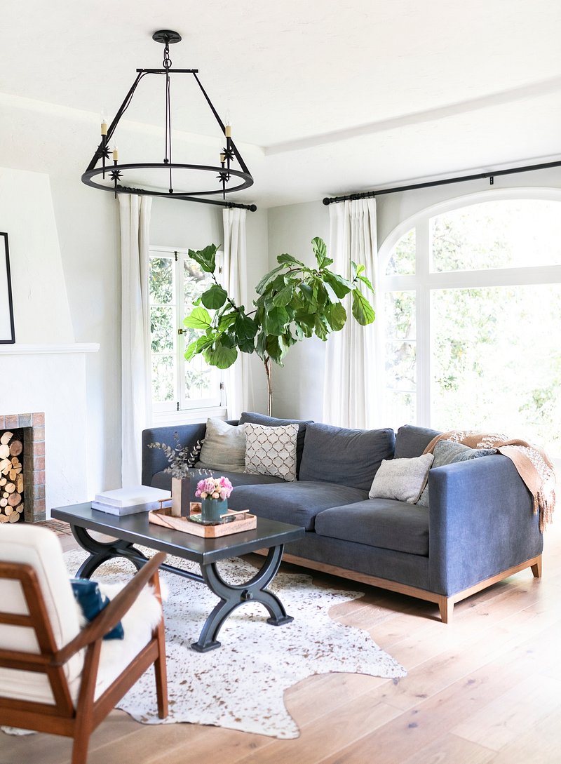
To choose wall art and mirrors that truly fit, start by measuring the wall space and aiming for pieces that occupy two-thirds to three-quarters of that area. For mirrors, position them to reflect a pleasing view or light source, not just an empty corner. When hanging art, align the center of the piece at eye level (about 57–60 inches from the floor) for a natural focal point. Group smaller works in a cohesive arrangement, leaving 2–3 inches between frames to feel intentional. Test scale and proportion by laying newspaper cutouts on the floor before committing. Above furniture, keep the width at roughly two-thirds of the sofa or console to avoid overwhelming or undersizing. Finally, mix mirror shapes with art styles to balance the room’s visual weight—these practical selection steps ensure every piece enhances the space without clutter or awkward gaps.
Calculating the Right Height for Hanging Frames and Panels
The golden rule for calculating the right height for hanging frames and panels is to position the artwork’s center at eye level, typically 57 to 60 inches from the floor. This standard aligns with average gallery sightlines, creating a cohesive and intentional look across your walls. To execute this precisely, measure the frame’s height, divide it by two, and subtract that number from 60 inches to determine where the top nail should go. For panels above furniture, keep the bottom edge eight to ten inches above the piece’s back, ensuring a visual connection without floating awkwardly. Always adjust for your household’s natural eyeline, as viewing comfort trumps rigid formulas.
Using Mirrors to Amplify Natural Light in Dim Corners
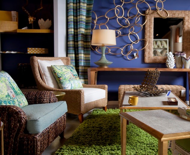
To brighten a dim corner, skip the lamp and grab a mirror instead. Place a large, light-toned mirror directly across from your nearest window—even if that window is in an adjoining room—so it catches and bounces daylight around the bend. Angle it slightly downward toward your furniture, not the ceiling, to push light onto seating or a plant. For the best **mirror placement for low-light rooms**, choose a shiny silver or chrome frame, which reflects more than matte black or wood. Avoid cluttering the reflection with dark objects; keep the mirrored view clean. A quick trick: lean a floor mirror against the wall at a 45-degree angle—it doubles the light without needing a nail.
Question: How do I know if a mirror is actually amplifying light?
Stand where the corner feels darkest and check if you can see the window’s reflection in the mirror. If yes, you’re golden; if not, shift the mirror’s tilt until the window appears, then test at different times of day to lock in that bright spot.

Grouping Small Prints into a Gallery Wall Without Mistakes

To group small prints into a gallery wall without mistakes, first lay them on the floor to perfect spacing—keep gaps between 2–3 inches for cohesion. Use kraft paper cutouts taped to the wall to map the arrangement before hammering a single nail. Start from the center print and work outward, ensuring the midpoint sits at eye level (57–60 inches). Mix frames with a shared color or material, but vary sizes to create rhythm. For a foolproof layout, stick to an odd number of pieces. Creating a balanced gallery wall with small prints requires consistent alignment along a single axis, either top or center, to avoid chaotic drift.
**Q: What is the most common mistake when grouping small prints?**
A: Hanging each piece independently without a pre-planned template, which leads to uneven spacing and crooked rows.
Function-First Decorating for Small or Multipurpose Spaces
In a studio apartment, the sofa becomes your guest bed, the coffee table transforms into a dining surface, and the bookshelf doubles as a room divider. Function-first decorating begins by mapping each square foot to a living need—then choosing pieces that serve at least two purposes without visual clutter. Multipurpose furniture like a drop-leaf table or a storage ottoman anchors the layout, while wall-mounted shelves free the floor for movement. For small space design, prioritize verticality: a pegboard near the entry holds keys and bags, eliminating a dedicated console. Every item must earn its place through daily usability, not just aesthetics. When a rolling cart acts as a bar, desk, and plant stand, you stop fighting the room and start living with it. The result feels intentional, not cramped—because every piece has a job and a home.
Multi-Functional Storage Pieces That Hide Clutter Beautifully
In compact interiors, multi-functional storage pieces that hide clutter beautifully serve as silent spatial managers, merging concealment with daily utility. A lift-top coffee table with internal compartments eliminates remote-control scatter, while an upholstered ottoman doubling as a blanket bin reduces visual noise without sacrificing seating. Benches with flip-up lids near entryways capture shoes and bags at the point of drop-off, and media consoles with sliding fronts mask tangled cables behind clean panels. The most effective designs anticipate the specific chaos of each zone, offering dedicated cavities rather than generic bins. When a piece performs two roles—like a wall-mounted fold-down desk with shelving—it removes the need for separate furniture, freeing floor area while keeping paperwork out of sight.
Q: How do you choose a multi-functional storage piece without overwhelming a small room?
A: Prioritize pieces that match your dominant clutter type—e.g., a storage bench for coats, a trunk-style coffee table for electronics—and verify that the hidden compartments are accessible without moving the entire unit. Opt for slim, low-profile forms with soft-close mechanisms to maintain a seamless visual flow.
Creating Defined Zones with Room Dividers and Area Rugs
In a multipurpose room, creating defined zones with room dividers and area rugs anchors each function without adding walls. Use a large rug to claim the seating area, ensuring all furniture legs rest on it to visually unify the zone. Place a freestanding or ceiling-mounted divider—such as a slatted panel or curtain track—behind a desk to separate work from rest. For a seamless approach, layer a smaller rug within a larger one to distinguish a reading nook inside a living space. Follow this sequence:
- Measure the floor and mark each activity’s footprint with painter’s tape.
- Position the largest rug first, oriented to the room’s main traffic flow.
- Set the divider at the boundary where noise or visual clutter needs blocking.
- Add a secondary rug or mat for tasks like meditation or dining.
This method reduces visual noise while keeping circulation paths clear.
The Best Curtain Tricks to Make Ceilings Appear Higher
To make ceilings appear higher, ditch the standard window-frame mount and hang your rod four to six inches below the crown molding, or even flush with it. This **vertical elongation trick** instantly draws the eye upward, creating a dramatic, lofty feel. Choose floor-length panels that just kiss the floor; anything shorter breaks the line and visually chops the room. Use lightweight, solid-colored fabrics in vertical stripes to amplify the effect, and opt for a curtain rod with minimal, sleek finials to avoid visual clutter. Extend the rod well beyond the window’s edges so the panels stack outside the frame, allowing more glass to show, which further enhances the spacious, airy atmosphere.
- Mount curtain rods closer to the ceiling than the window top to emphasize height.
- Select panels with a continuous vertical stripe pattern for an elongated optical illusion.
- Stack the sheerest fabric possible to keep the space feeling light and unbroken.
Refreshing a Room’s Look With Minimal Cost and Effort
You don’t need a renovation to fall back in love with a room. Start by moving one large piece—like a sofa or bed—to a new wall, and suddenly the whole space breathes differently. Swap two or three throw pillows from another room, and the color story shifts without a single purchase. Roll up a rug you’ve had for years and layer it over a plain carpet for instant texture. Repositioning a mirror to catch natural light can make a tired corner feel airy. What’s the cheapest single change? Just rearranging your existing furniture and accessories—it costs nothing, takes an afternoon, and delivers a fresh perspective you can live with.
Swapping Hardware and Fixtures for Instant Visual Impact
Swapping hardware and fixtures delivers disproportionate visual return for minimal outlay, making it the most efficient first step in a low-budget refresh. Replacing dated cabinet knobs, drawer pulls, and switch plates instantly recalibrates a room’s perceived age and style, without structural work. Prioritize high-touch, high-visibility items: entry door handles, kitchen faucets, and lighting pendants create immediate focal shifts. For logical execution, follow this sequence: audit all visible metal and plastic fixtures, then match new finishes to existing undertones (brass warms, matte black grounds), and finally install consistent hardware across aligned surfaces. A uniform finish across adjacent cabinetry and lighting eliminates visual clutter, while contrasting the main fixture finish against wall color adds depth. This targeted swap transforms perception before any paint or furniture changes occur.
Incorporating Greenery and Natural Elements That Thrive Indoors
Incorporating greenery that thrives indoors is a high-impact, low-cost refresh, provided you select species matched to your light levels. Prioritize resilient options like pothos, snake plants, or ZZ plants, which tolerate neglect and low light. To avoid failure, start by assessing available natural light, then choose plants accordingly. Next, group plants with similar watering needs and use well-draining pots to prevent root rot. For visual cohesion, mix trailing varieties on shelves with upright forms on floors or tables. Adding natural elements like dried branches or moss accents can complement the living plants without requiring extra care. This approach ensures effortless indoor plant styling that instantly elevates a room’s texture and warmth. Hardy species are the key to sustaining this minimal-effort transformation.
- Test light intensity in each corner before purchase.
- Begin with three to five low-maintenance plants across varied heights.
- Rotate pots weekly for even growth and dust leaves monthly.
Seasonal Accent Swaps That Keep a Space Feeling Renewed
Seasonal accent swaps deliver maximum visual impact by targeting high-touch, low-commitment surfaces. Rotate throw pillows, bed linens, and table runners to introduce texture shifts—chunky knits for autumn, washed linen for summer. Swap lamp shades for deeper hues in winter and sheer, light-filtering options in spring. Exchange wall art or framed prints to mirror seasonal palettes, and replace vases or candle vessels with materials like ceramic, rattan, or glass. This systematic rotation—starting with textiles, then hard goods, then greenery—keeps a room feeling renewed without repainting or buying furniture. Rotating accent textiles and accessories every three months ensures the space adapts to natural light changes and your evolving comfort needs.